Programming
Software design: Simple is beautiful

Last year David Pogue gave a compelling talk at the TED conference – Technology, Entertainment, and Design. David’s talk was on the state of software: simplicity vs. the accelerating pace of complexity. Users, interface design, and a few musical numbers on frustration with tech support, Bill Gates, and Steve Jobs.
The 22:00 minute video below is entertaining, informative, and is well worth its time to watch.
My favourite part is about the “software upgrade paradox”.
If you improve a piece of software enough times, you will eventually ruin it.

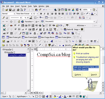
I couldn’t reproduce the blurry screenshot shown in the video, but opening all the available toolbars in Microsoft Word 2000 still brings the user interface close to madness. I could see the first couple of rows used for point-and-click formating, but just try and guess what the rest of all the features are. Notice how some of the icons are identical, yet all call a unique function.
The hard part is not deciding what features to add, it’s deciding what to leave out.
Remember, simple is beautiful, lets try to keep the software that way.


I agree one hundred percent. I don’t like trying to use software that is overly complicated or messy. Just to test how much worse Office got in the 2003 edition (which I have) I did the same thing you did, and mine turned out even worse. Clean, Simple, Functional. These are the things I look for when I look at software.
Reply to comment
I don’t think you are forced to leave features out to make the user interface better. I think you can simply allow the basic user access to basic features, while allowing those in-the-know access to all the features of the program.
I think that’s why the “Settings’ dialog boxes frequently have multiple tabs in them, simply because of the number of features. And really, that’s the way to go. Hide features that the user doesn’t normally access, but still could come in handy.
Reply to comment
@Adam, 99% of the users out there only bought Microsoft Office to do simple word processing. They don’t give a damn about any of the other crap that’s in there. So why add it in?
Reply to comment
@Clayton, You add those features to give those 99% of users a feeling that they are purchasing a better product than what they had before. And to give 1% of users the chance to make older versions of Office obsolete.
I was, however, talking general terms. I don’t think Office should be a prime example, simply because the vast majority of people only use it for word processing, and those “features” are just excuses to sell a new version.
Reply to comment
@Adam, Clayton – in the video David addressed the problem as the “SUV syndrome” – people having a need to surround themselves with features they don’t need, but might use in the distant future (probably no sooner than the next version of the software will come out).
I think the important point here is to make sure that your core features work darn well, before developing a truck-full of “extras” to sell the above mentioned core features.
Reply to comment
Haha, I guess that’s what happens when I don’t RTFA (or video)
-1 Redundant
Reply to comment